
"No Holding Back FileMaker Blogging"


|
Navigation:
|
Support this site by clicking on a sponsor below or becoming a patron!

Tips & Tricks Videos

Become a patron of this FREE web site!
|
|
Recent Blogs:
|
Currency Formatting
 |
Gathering Portals
 |
Multiple Choice Picker
 |
Popups and Pickers
 |
Window Locking
 |
|
Meta-Consulting
Meta-consulting is a service Database Pros offers to help other developers
over programming hurdles via GoToMeeting. Email John Mark Osborne or call John Mark at (909) 393-4664 to find out more about this service.
|

Fireside FileMaker Podcast
|
Quick Tip:
|
Closing Hidden Files
FileMaker Pro will open files as hidden if needed by a relationship. Often, what happens is that you get tons of files open. When you choose the hidden files from the window menu so you can close them, they often open another related file. This can be very frustrating. One way to get around the issue is to know that you can close hidden files by choosing Close from the File menu. In other words, files don't have to be visible to be closed. Just choose Close from the File menu or type the keyboard equivalent. Files will be closed in descending order. |
|
|

Create a Password Management solution!
|
Fun Stuff:
|
FileMaker, Inc.
FileMaker, Inc. or FMI is a wholly owned subsidiary of Apple, Inc. It was once named Claris when it also sold MacWrite, MacPaint, Claris Emailer, ClarisWorks, etc. but changed it's name in 1998 when it focused on FileMaker. FileMaker started out as a DOS application called Nutshell but was shaped into the powerhouse it is today by Claris and FMI. |
|
|

FileMaker 20 Video Tutorials
|
RSS Feed
|
|
|
|
Interface Ease
|
Level: Beginner
Version: FileMaker 16
Category: Layouts
Thursday, May 10, 2018 |
|
|
|
|
|
|
|
|
|
|
|
|
|
|
|
|
|
|
|
|
Good interface design should be instantly recognizable and immediately useable. Creating an appealing layout is easy with themes. Designing a functional layout is another story. There are many techniques out there for developing intuitive interfaces but I prescribe to the grid. Grid interfaces provide a clean, organized and calming effect on users. Your interface design can make or break the success of your project, so design carefully by starting with a well designed form and list layout based on the grid system. Not only will the grid system be covered but a plethora of other interface tips, tricks and guidelines for creating successful interfaces without a ton of effort.

The Grid
The grid is simple. Grids are no different than what comes to mind when you think about the basic meaning of the word. They are sort of like the grids in layout mode but a little more varied in their appearance than a checkerboard. In other words, grid interface design doesn't mean every object has to be the same size. It defines that related items should be placed together so they fit pleasingly within the spatial confines of the grid. Not every group of objects has to be the same size either but like sized groups of objects will be perceived as related. Each grouping of objects should have an equal amount of white space between each other to be perceived as being on one part of the grid or the other.
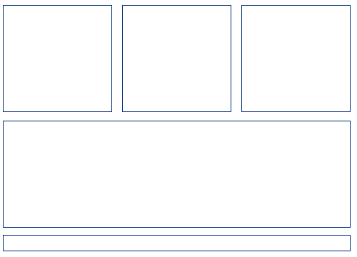
Use the grid system as a foundation but don’t blindly adhere to the structure or you will curtail your creativity. Think of the grid as a guideline that will make it easier for users to grasp onto your interface. Be creative but keep the grid in mind all the time. Just group like items together, line them up and you will have a grid interface. Throw in your flair and you are done. Easy as pie. What you don't want to do is have disarray. Organization is the key to a successful interface.
If you’ve ever designed a web site, the most important HTML tool is the Table tag. It forces you to design your web sites into grids. As you gain more experience with HTML, you start placing tables within tables to create more complex grids. In fact, the web site where you are viewing this article is based on a table structure. Hopefully this analogy helps but I'm guessing most people don't type HTML from memory anymore, favoring a WYSIWYG editor.
Maybe this analogy will help a broader range of people. Grids are like the outlines in the coloring books of your youth. They are meant to keep the colors in specific areas of the artwork. Think of grids as the glue that keeps your creative mind from straying to far outside your concept. It’s like a song that follows a particular rhythm throughout or a painting that uses the same style on the entire canvas. Consistency is just as important as creativity so be wise and design around a grid but don't be a slave to the grid.
SIDETIP: The Gridulator is a great web site that generates grids based on the overall size of your layout, columns and gutters. A simple but very useful tool.
FileMaker Grids
Examples of grid interface are as easy as looking at the FileMaker dialog boxes. Reading from top to bottom and left to right, all the navigation is at the top in the same place. Items below are spaced evenly and indented to convey belonging to the items above. It’s really that simple.

Screen Size
One of the most forgotten interface considerations is screen size. Make sure you know your audience so you don’t end up with scroll bars where they shouldn’t be. Form views should never have a scroll bar and list views should only scroll vertically. Whether your audience is private or public, screen size is a crucial design concern.
I remember a story at one of the first FileMaker Developer Conferences. I was working at Claris at the time and attended the conference as a technical support specialist. At this event, there was a proficiency test, which is similar to the current certification test. The test was actually created using FileMaker. One of the developers taking the test stormed out and somehow found me. He was angry because he missed the last answer on every question because there was a scroll bar to see it. To make a long story, short, this is a lesson in interface design. Scroll bars are for scrolling through lists of records.
When I start working with a client, the first thing I ask them is what platforms and screen resolutions they will be using. I always design to the lowest common denominator resolution and use the Autosizing feature to grow the objects for larger resolution screens. That doesn't mean I fill the entire monitor with my layout. It's just a starting point. I also have to consider docks, task bars and other interface elements, as well as the customer requirements. Rarely do I fill the entire screen with a solution since that restricts functionality. For example, how can a user look at two FileMaker windows at the same time if they both fill the entire screen.
Don’t Custom Design
One thing you should never, in the FileMaker age of themes, is custom design your own interface. Prior to FileMaker 12, themes weren’t anything special. They simply pre-formatted your layout for a look and feel that was honestly underwhelming. No serious FileMaker developer ever used these themes in a professional solution. Everything was custom designed. Most developers would start by selecting a template with an interface that was designed already and add onto it. Even with a template, I always told my clients interface was fifty percent of the cost of a project.
FYI: Heather Winkle is the former Product Manager of User Experience at FileMaker, Inc. I learned a great deal about interface design from her tenure at the mothership.
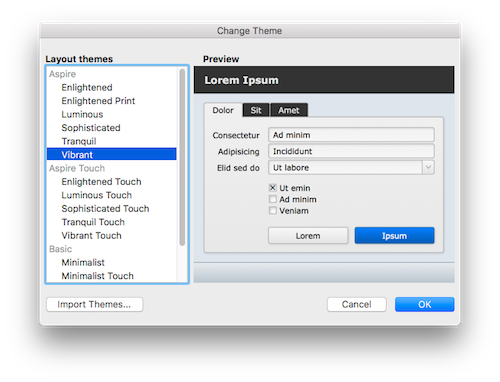
Themes in FileMaker 12 and later are much more sophisticated. They control all aspects of the user experience, not just background colors. Not only that, you can update themes at the object level. If you don’t like the hover state for an object, simply change it and save it to the style or even the theme. If you decide you don’t like a theme, you can change to a different theme.
If you feel the need to be unique, you can easily design your own theme. Just start from scratch or use one of the existing themes as the foundation for your project. Everything you need is built into FileMaker. Gradients, object slicing, padding, corner radius, shadows and much more. No need to use Photoshop anymore. The point is, themes will save you tons of time. Not only can you offer your clients many different interface designs, but themes are easier to work with. Alignment features like Guides and Dynamic Guides work better with FileMaker defined objects than Photoshopped graphics.
Themes have also been tested cross-platform. There is no need to build a preliminary interface and test on Macintosh, Windows, iOS and WebDirect. It’s all been done for you. Just grab a theme and run with it. All you have to do is decide on the screen sizes and the layout types.
SIDETIP: If you add a theme and remove it, the theme is still stored inside the file. In some cases, themes carry a lot of weight such as the case with Luminous. Luminous enlarged a test file by over one megabyte even after it was removed from the layout it was assigned. Enter Manage Themes and delete a theme if you are no longer using it on any layout.
Most themes also have iOS counterparts. If you know a project is going to allow iPhone or iPad connections, it’s a good idea to select a theme with an iOS companion theme. If you like a theme that doesn’t have an iOS companion theme, chances are one of the Starter Solutions has been designed around the theme you like with a custom designed iOS layout that you can borrow.
While it’s important to pick a theme and stick with it, it’s not difficult to change to a different theme. All the objects on a layout will change to the new theme with one click of a button. You may have to adjust some objects if they get bigger but, in general, it works fairly smoothly. If you have a lot of layouts, it does become a little cumbersome to change the theme on every layout so try to make changes early in the development cycle.
SIDETIP: After changing a theme, the first undo keeps the new theme but adds any previous style changes made to the objects like bold text, line changes or padding. The second undo reverts the layout back to the previous theme in entirety.
Layout Consistency
Please, please, please don't change your layout size throughout a solution. It will drive your users crazy. One layout size across all form and list views is good enough. Frame your layout on open using the Adjust Window [Resize to fit] script step and then don't change the window size during the rest of the session. Make sure you use a form layout for the framing as list view will adjust the vertical size to match the screen height.
Alignment
Too many developers don’t spend enough time lining up their fields and labels. Even a point difference on the edge of two objects or the distance between two objects will be perceived by the mind as disarray. This can be very disturbing for the user even if they can’t consciously pinpoint the interface issue. Besides, Dynamic Guides make it is so easy to line things up, providing no excuse for unaligned objects. In addition, Dynamic Guides work best with themes so don't photoshop all your buttons.
Colors
Rainbows and unicorns are for little girls and not interface design. Use color to draw the attention of the user to a button or other feature. A handful of different colors at most is sufficient for most any interface. More than five different colors and they lose their meaning. The brain stops being drawn to colors and instead becomes overwhelmed and confused.
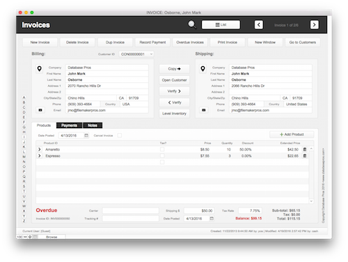
Interface slang often refers to poorly designed interfaces as “angry fruit salad”. I once saw an interface that color coded every single column... and, there were a lot of columns. That doesn’t even include the variety of colors included in the header and footer. The developer explained that every color meant something. The problem was he had gotten to close to the design and forgotten to step back to view it from a users point of view. When you spend so much time with an interface, it’s important to have rules so you don’t go overboard.
No Table Views
Never, ever, ever use table views in a professionally designed solution. Table views are a view for someone who knows how to work with FileMaker already and doesn’t want to create an interface for a privately consumed solution. Yes, some interface elements can added to a table view but it will never match the look and feel of your form and list views, creating an amateurish interface.
Table view also allows access to features that can be confusing for users like creating fields, reporting and charting. For example, even with the status toolbar hidden, a user with data entry access can create a chart. Nobody without significant FileMaker experience should ever see the charting dialog with it’s access to fields and calculations. Even if a user is disabled from using a feature, it still causes confusion because they can still see it dimmed in the menu area.
Since table view menus cannot be controlled via Custom Menus, it is always a poor choice in a professional solution. My motto is to only give users what they need to accomplish their job and nothing more. In other words, they don’t need to see every feature in FileMaker to use a particular solution. Remove the clutter and confusion by actually programming a solution that just accomplishes the task at hand. It really isn’t that hard and will pay off in spades with a simple and easy to understand interface.
Creating Layouts
Never start creating a layout without a plan. If you have designed hundreds of layouts already, the plan is right in your head. If you haven't then let me go over the process I have come up with over decades if working with FileMaker. I almost always create a new layout from one of two types of layouts: form or list. The layouts themselves can be wrapped in a variety of themes so it is the organization that is so important to good interface design.
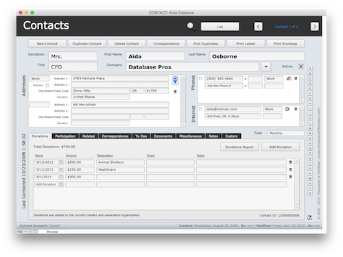
I start by placing a title for the layout in the upper lefthand corner in the header part because that’s how people are trained to read, left to right and top to bottom. Any well designed interface works in this manner. Also in the header, but in the upper right hand corner, are common navigational and feedback features. This is where a user can switch between form and list view, view the current and found set of records, navigate between records and initiate a find. If the solution has a main menu or dashboard, the icon should be placed in this area as well. Other than these items, keep the header area uncluttered.
Right below the header, I like to create a row of buttons that are specific to the data the user is currently viewing. Actions like new record, delete record or print are good candidates for this area but navigation related to working with data showing on the screen can also be included. Below the row of buttons is key data that should display no matter what tab is selected. In a contact manager, this would be information like first name, last name and company name.
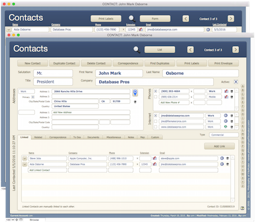
A soon as you have decided how much room is needed for the primary fields, fill the rest of the body part with a tab control object. Tabbed interfaces are the most intuitive interface for users. For starters, users see tabbed interfaces all the time and feel comfortable how to work with them. Secondly, the reason users feel comfortable with tabbed interfaces is not just familiarity but also because they pack tons of information into the same virtual area. When clicking from one tab to the next, the user never feels too far removed from where they were before, as opposed to interfaces that switch screens completely.
Finally, at the bottom of the screen is creation and modification information, typically in a smaller, less conspicuous font size. Everything regarding a list view is virtually the same with the exception of the list of records and the row of buttons below the header. I find it confusing for users to understand which record a button acts upon, even if it is obvious to you and me.
If required, header text can be placed above each column of data and buttons attached that sort by that column. Never show the sort dialog to a user as they will see a sea of fields that don’t necessarily have any meaning. I would go even one step further and say that sort is unnecessary and should be reserved for reports. Users are too familiar with spreadsheets that aren’t designed to create found sets and thus rely on sorting to find the information they desire. Retraining users is difficult but will change their experience of FileMaker dramatically.
Finally, when navigating between form and list views, make sure the title, navigation buttons, creation and modification fields in the header and footer do not move. It's not a video game but a professionally designed solution so the information that is the same from layout to layout should be in exactly the same location. No exceptions if you want a professional looking solution.
Finds
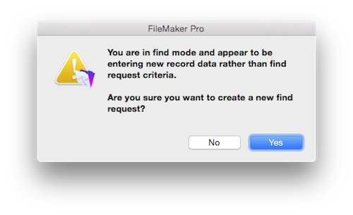
In versions of FileMaker prior to 13, it was important to differentiate browse mode and find mode. One of the most common reasons for losing data in FileMaker was accidentally entering data into find mode. When the file is closed, the data is lost. I know this because worked in Claris technical support for five years and listened to more than a few frantic phone calls. Losing data in find mode is the very reason Claris added warning messages when adding more than ten find requests and FileMaker, Inc. added magnifying glasses to fields in find mode.
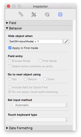
In previous versions of FileMaker, I recommended a separate layout for browse and find mode. While this created extra work for the developer, it prevented confusion between browse and find mode. Maintaining two virtually identical layouts is annoying but so worth it in user satisfaction. In FileMaker 13 and later, two layouts are no longer needed. It is extremely easy to hide any object in find mode with a simple calculation formula and the Hide Object feature:
Get(WindowMode) = 1
It’s very important to also check the option to "apply in find mode". This simple formula enables you to maintain a single layout by hiding buttons, fields and other objects unnecessary in find mode. Examples include global fields which can’t be searched anyhow so why confuse the user. Scripts can have perform different actions in find mode or even take the user back to browse mode so it is best to hide buttons irrelevant to find mode.
You can even make objects appear like the words "Find" where the title for the layout was shown before. Just use the opposite of the code shown previously:
Get(WindowMode) = 0
FYI: Get(WindowMode) can return five values: 0 for browse, 1 for find, 2 for preview, 3 if printing is occurring and 4 if the Data Viewer is evaluating while in layout mode. I've only ever used 0 and 1 so don't mid the others.
You could even make a block of color appear so it is really obvious the user is in find mode. I also like to make a Continue and Cancel button appear in find mode. The key here is making it clear where the user is so they don’t make a mistake and enter browse data into find mode.
For more information on creating a complete find script, see the article titled the Ultimate Find.
Duplicating Layouts
Once you have a good form and list view layout designed, you can add them to your template and create new solutions efficiently. If you don’t have a template, at least base all your form and list views off the originals. No sense in reinventing the wheel each time you create a new solution, just duplicate the same layouts over and over again, and make the necessary changes. Good form and list layouts can also be used as a foundation for other layout types to provide a good foundation for a consistent interface. Don’t expect to get everything right the first time but, with practice, you will get better.
Excessive Adaptation
No matter what you call it: indirection, adaptive or dynamic, it's all the same. It's about reusing code. You might have a single script for deleting portal rows that displays the appropriate message using script parameters. Or, maybe you have a calculation that adapts to the context of the current layout to display a different label. I love this stuff but there is a point at which it can be taken too far. You know this is the cause when a script takes too long to run, a layout too long to reload or a calculation too complicated to edit weeks later. Use adaptive programming when it really benefits the solution at hand and doesn't create a ton more work. It's not about providing the coolest code but programming pragmatically.
Starter Solutions
I don’t recommend using Starter Solutions to begin a project because you don’t know how they work. Design your own templates so you are intimate with every nut and bolt. This will make your project much more efficient. In addition, Starter Solutions are generally very basic in their relational design, often using multiple fields or repeating fields where a table should be employed.
What I do recommend Starter Solutions for are interface inspiration. Every Starter Solution is designed with a theme so you can really see how a theme looks wrapped around a real solution. Starter Solutions also contain custom designed graphics matching the theme that you can’t get with just the theme itself. I like to borrow these graphics so I can provide a consistent looking interface. Finally, Starter Solutions provide programming techniques you may find useful. For instance, I learned how to program a script to select the proper layout for the appropriate device by examining the open script in a Starter Solution.
You can also develop your own template from which to begin your own solutions. A good starting point for a template is a theme. A template will contain so much more than just a theme but you have to start somewhere. Templates include standard scripts, fields, custom functions, custom menus and much more. They often take years to develop and continue to evolve after each project is completed.
FLF
Stick with standard FileMaker design which I like to call FLF or Find-List-Form. It's just like searching the internet. You search on Google, it presents a hit list and you click on the web site you like. Click the back button, look at another web site and repeat. This is no different from how basic FileMaker functionality is defined. If you try to reinvent the wheel, you make it harder on yourself, more expensive for the client and harder on the developer who adopts your solution. For more information on FLF, see FLF.
Author:
John Mark Osborne
jmo@filemakerpros.com
www.databasepros.com
This blog is completely free. Please support it by clicking on one of the advertisers at the left side of the window or becoming a patron. Thanks so much!
|
|
Comments:
|
|
|
John Mark Osborne
|
11/09/2018
|
|
|
UPDATE: I highly recommend watching this video from the WWDC 2018 Intentional Design. It stresses simplicity, white space, subtle design and many more things that will guide you to a modern and easy to use interface.
|
|
|
Steve M
|
05/10/2018
|
|
|
Another great article. I wouldn't worry about 'being late'.
It's always worth the wait!
|
Response by: John Mark Osborne
|
05/11/2018
|
|
Glad you liked the article and I appreciate your kind words. I just don't want to be in the situation where my article releases get pushed out farther and farther. There's a lot of stuff to write about and I want to make sure readers can expect regular fresh content.
|
|
|
|
John Mark Osborne
|
05/10/2018
|
|
|
Sorry for the delay in releasing this article. I like to release new material every two weeks but I got delayed with a client emergency. I didn't want to release this article without reading it over at least half a dozen times. Thanks for your patience and Happy FileMaking!
|
|
|
|